Guide / The entry page
Design the entry page
Place blocks on a grid, per screen size, and see the result as you go.
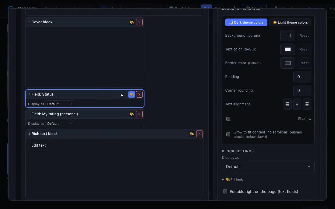 Hover to play
- On any entry press Customize layout (needs the “Edit collections & schema” permission).
- Add blocks from the palette at the bottom: Structure (Title, Cover, Rich text, Accordion, Tabs, Related items, Parts, Button/link, Divider, Section), Media blocks (Image, Image grid, Image strip, Slideshow, Video, Video gallery, Audio, Playlist, Document, Document set) and + Field… for any field of the schema.
- Drag a block by its title strip to move it and drag its corner to resize it. Click the block (or its 🎨 button) to open its settings on the right.
- Press Save layout. Reset to default goes back to the standard page.
One design, four screen sizes
The tabs above the grid switch between Mobile, Tablet, Desktop and Ultrawide. Each size has its own arrangement, so you can put fields side by side on a wide screen and stack them on a phone. Next to the tabs you can change how many columns each size has and the gap between blocks. The Preview theme switch shows the page in dark or light.
Tip. A block that is missing from a size’s arrangement is added at the bottom of it, so a new block never disappears from one screen size.
Sections
A Section groups blocks in a small grid of its own, with its own columns. Open it with “Edit section contents”, arrange what is inside, then go Back to main layout. The section moves and resizes as one block.